SEFT Consulting Group
project: Brand Identity
design: Matt Moore
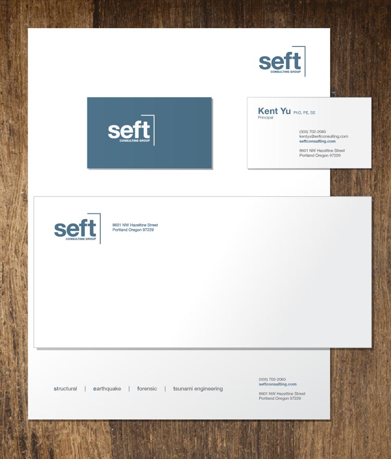
I designed this logo for the SEFT Consulting Group. They specialize in keeping buildings upright and infrastructure in place when catastrophic things happen. Their name is a bit of an acronym – Structural, Engineering, Forensics, and Tsunami engineering.
I wanted to start with the font that is recognized and trusted around the world. Helvetica is a very civil font. It is easily read and accommodating which is why we see it used to direct humans in airports, shopping malls and stadiums. We trust it.
The simple right angle represents many things to us. We all made a big list of things it reminded us of and everything on the list was both relevant and positive. For me it simply suggests an upright structure and it seems to be supported by the name at the left. – SEFT keeps order.
I designed their website also.

