Mt.Up
project: Logo
client: Hobo Industries
design: Matt Moore
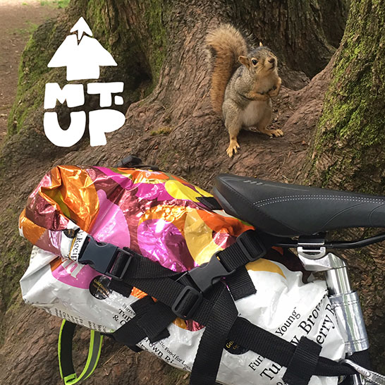
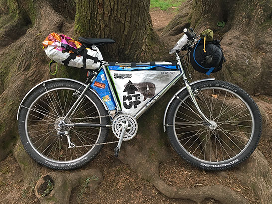
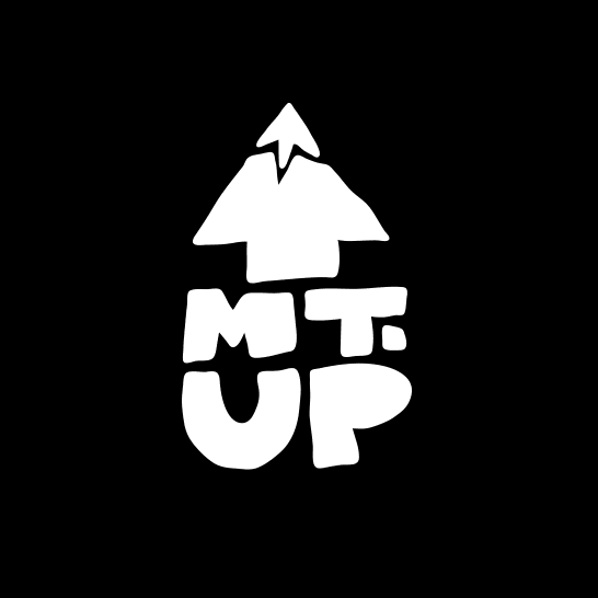
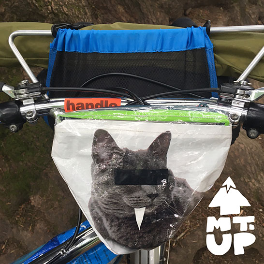
This company makes custom made lightweight bikepacking gear out of recycled materials. They needed a name and brand. They are unapologetically low-fi and wanted a way to reinforce their unique niche in the emerging bikepacking market. I came up with the arrow/mountain and said to myself; “Mount Up!” It conveys multiple relevant concepts, and a historical call to action that inspired people to saddle up and join the adventure of their lives.
These pack makers often spray-paint over the existing brand names so I suggested a logo mark that would look intentionally DIY and be easily stenciled. By spray-painting the logo they can cover up existing logos and continue their sustainable anti-branding approach to branding. No two bags are ever alike. They are half the weight and can be repaired with packing tape out in the wild. Try doing that with pack cloth.


